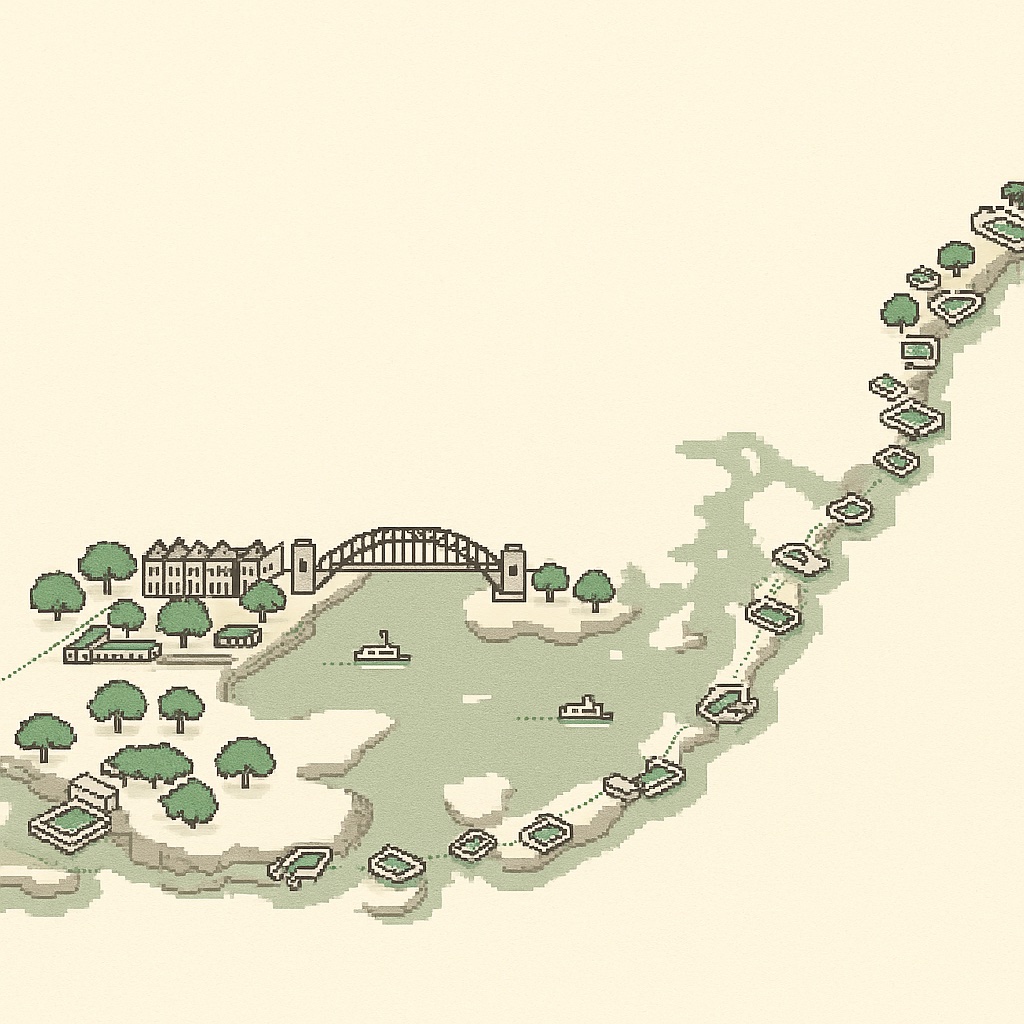
Sydney as a game map: why we drew every building in the inner city
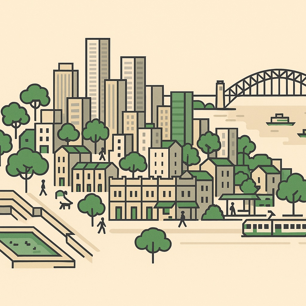
Open the map and you're looking at inner Sydney the way a strategy game would draw it: every building extruded to its real height, every street with its real lane markings, and inside the buildings — the businesses that actually occupy them, each on its own card. No aerial photos, no generic pins. A hand-built canvas engine, and a city's worth of open data.
What you're looking at
Every box on the map is a real building footprint from OpenStreetMap, extruded from its recorded storeys or measured height. The towers along George and Pitt rise exactly as many floors as they do in life; the terraces of Paddington stay two storeys, iron lacework and all. When a building holds more than one business, a ×N badge tells you how many — click it and the whole building opens like a drawer.
Why the inner city, not “Greater Sydney”
Sydney the metropolis is enormous — it sprawls from the Hawkesbury to the Royal National Park and holds more than five million people. Sydney the city you walk through is much smaller, and much denser. The map covers the strip from Balmain to Bondi and from North Sydney down to Kensington: the CBD, Barangaroo and Pyrmont, Surry Hills and Darlinghurst, Newtown, Glebe, Redfern, Marrickville, Potts Point, Paddington and the beach suburbs. In that strip sit roughly 54,000 buildings, about 7,800 businesses, and 644 buildings over ten storeys. An isometric map lives on density — drawn at metropolitan scale it would be a sea of red roofs between distant town centres. Drawn at inner-city scale, it looks like the Sydney you know.
A city cut in two
Here's something you mostly notice from above: Sydney never agreed on a grid. The CBD's spine — George, Pitt, Castlereagh — runs close to true north down the ridge between the coves, while the dense flat country to its south, Surry Hills and Redfern through to Alexandria, settles onto a near-cardinal grid of its own, and Newtown, Bondi and Balmain each follow their own ridgelines. Then the harbour does what no Melbourne river ever could: it cuts the coverage clean in two, with North Sydney sitting across the bridge like a second, smaller downtown. The map wears all of it honestly — the water is the biggest shape on the canvas, and every shoreline wriggle is real.
Where the data comes from
- OpenStreetMap — footprints, streets, parks, the harbour, and the businesses themselves, maintained by thousands of local mappers (ODbL).
- The Australian Business Register — ABNs matched to listings, so the “Registered business” badge means what it says.
- G-NAF and the ABS Census 2021 — addresses, suburbs and postcodes kept honest, with the numbers behind every suburb.
- Wikidata — the landmarks and institutions, cross-referenced so the famous buildings know what they are.
Every card says where its facts came from and when they were last synced — and corrections flow back into the open datasets, so a fix here is a fix for everyone. The full list is on the about page.
What's next
The map is the start, not the finish. Trains and ferries, heritage buildings, school catchments and more city layers are on the way — and if you run a business anywhere on the map, your building is already drawn. Claiming your card is free and takes about a minute.